Zoe Stillpass: I think we can start by saying that a few years ago, you decided to shift from figuration to abstraction. I loved how this decision to take the plunge seemed so necessary to you, a desire almost outside of your control. Could you speak a bit more about this decision?
Julie Beaufils: In my paintings, the line itself had become too present. The shift from figuration to abstraction was made progressively after a series of figurative ink drawings. In this project, each drawing referenced Western popular culture from the 20th century – a film, a video clip, a song. In the end, the line became more and more like a sign, or even a logo. As if it enclosed each form within a mimicry of itself, an image easily recognizable and classifiable among other symbols. Nothing wrong with that, but for me, it was as if the line had become more of a limit than a tool. At around this same time, I made my first trip to Brazil for an exhibition. Seeing the art and architecture of Brazil made me realize that what I had thought was figurative or abstract didn’t really make any sense over there, but rather that this distinction is Western, or resulted from my Western way of making sense of a new reality. It’s the uncertainty of the separation between figuration and abstraction that I find interesting. This zone between the two where everything fluctuates is full of potential, for nothing is ever defined or immutable. In this way, softening the edges within my painting, as well as deepening my research into colors, both seemed like natural progressions.
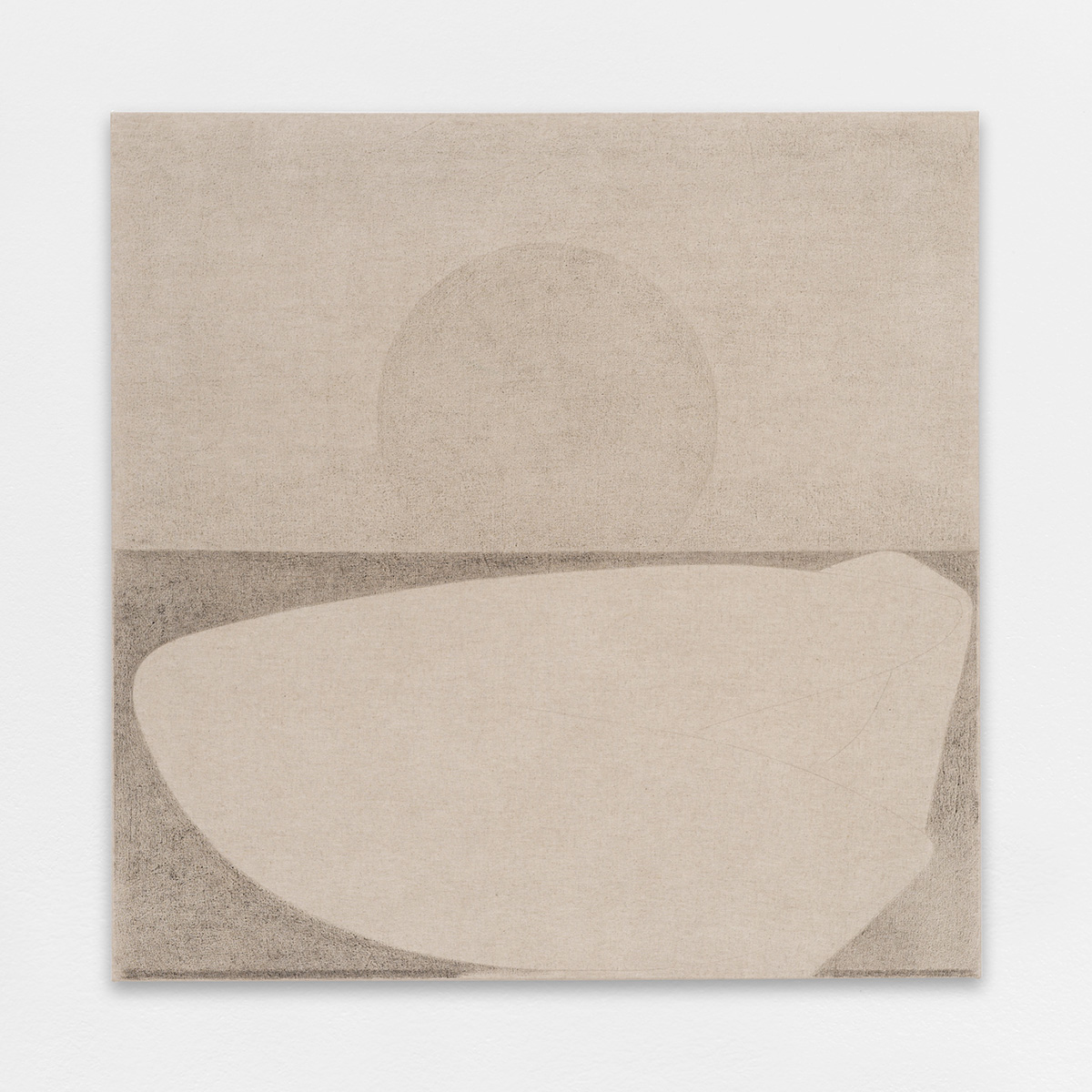
Untitled, 2018. Graphite on canvas, 100×100 cm / 39 3/8×39 3/8 inches
Z.S.: Could you explain the technique that you have developed, your way of working?
J.B.: Without completely abandoning figuration, I kept drawing as a fundamental practice. Each drawn line then began to exist in its own right within a composition, no longer being the edge of something else. Because of this, I have completely changed my way of working – from how I prepare my canvases to mixing colors. I choose to work with a very lightweight canvas, and during the sizing process, I make sure that the original raw color is conserved. This makes the diluted colors appear more matte. Many layers of different shades are necessary to produce any given color.
Z.S.: What immediately struck me in your recent paintings were the colors. The combinations are both very beautiful and very strange. There is a kind of vibration between the colors that creates atmospheres. Could you speak more about your choice of colors and their importance?
J.B.: In each painting, the color combinations depend on the initial color, which then sets the work in motion. It’s like a chain reaction. As soon as the first glaze is applied to a part of the canvas, other shades of this same color suggest themselves. Then, when it appears balanced, the goal is to find a color that could destroy this equilibrium. And so on and so forth. What often happens is that, at a given moment, a particular color changes the direction of everything. This color and the way it makes the other colors vibrate takes the painting to an in-between space, where the composition no longer represents anything in particular but instead diffuses an atmosphere, opening onto different perspectives.
Z.S.: There is a relation between this diffused atmosphere and the affective power that these paintings possess. It makes me think of the concept of ‘affect’, as in the pre-conceptual and pre-individual intensities that traverse both human and non-human bodies, and thus inform our experience. When I was at your studio the other day, your paintings provoked intense sensations in me, as if the paintings were acting directly upon my body. Could you speak more about this affective relation that your works produce?
J.B.: Yes, the body’s reaction before a painting has always been a preoccupation of mine. Painting is, of course, a visual experience, but I think that the scale of a painting, as well as the way that the colors vibrate, equally act upon the body. How one positions oneself in relation to the painting also influences the way, we physically perceive it. I find contemporary ballet particularly inspiring for this reason. The last work I saw would have been last winter when the Théaâtre National de Chaillot put on a series of works to celebrate the centenary of Merce Cunningham. I saw a revisited version of the ballet Walkaround Time, and I was really taken by the way that the dancers moved alongside the works placed on the stage. Across the duration of the piece, you started to notice the dancer’s bodies becoming tired, sweating, while Duchamp’s objects remained impassive. It was as if the dancers were worn out by their very presence, trying to find the right angle to respond to them. More recently, I have been watching a video of the Bolero, choreographed by Maurice Béjart and performed by Sylvie Guillem and the Tokyo Ballet. I find this performance visually very powerful. A large red circular plinth is placed in the middle of the stage and Guillem’s body moves as though she were performing some kind of incantation as if her body were propelled by the force of the color red, or the other way around as if the color red were diffused throughout her body. The relationship between color and corporeality is fascinating. This seemed even more evident in March and April, during the confinement. During this period, I was still able to go to my studio, and I worked on many large paintings. Over this time, specific colors became predominant, mainly red and yellow. It was as if the luminosity of these colors was physically necessary, a kind of unconscious reaction to the health crisis. The reverberation of the finished paintings throughout the space of my studio created a particular atmosphere, as though they were sources of heat. Being both, as you say, affective presences, but also visual agents of this warming sensation. In any case, that’s how I was thinking about them at the time. Then you came to my studio and told me how the paintings made you feel. The question of affect is important for me because I think, like you, that it is possible for a painting to affect the viewer physically. This, to me, is linked to the inherent power of color. When together, something sensual occurs, as though the two were physically touching. Sometimes I have the impression that it’s like an intuition, or like finding a solution to a problem you’ve been dwelling on for a long time.
Z.S.: I think that there is a link between your use of colors and this zone of indiscernibility between figuration and abstraction that you mentioned earlier. Due to the variation of intensities created by the vibration of colors, the painting captures non-human or pre-personal affective forces. And it’s here that a space of transformation or emergence reveals itself, between the figurative and abstract, where nothing is fixed, and everything is in a state of becoming. Could you speak more about the creation of this space of possibility?
J.B.: Yes, I really like this idea of a space of emergence. I also think that this is a good description of the process of drawing before the paintings are made. Certain drawings consist of only a few pencil lines. They mark zones that then become forms. These zones rarely have a closed edge, as if they were in a process of continual expansion, their ultimate limit being the stretcher itself. When these zones are defined, they are often irregular and imperfect ovals. I see them as the step before the birth of a shape or a figure. A moment when everything is still unformed, before the figure emerges, or like you say, ‘when everything is in a state of becoming’. I like to think about this ‘space of possibility’, as you put it, as a neutral terrain. In painting, colors completely change everything. They ground the composition in a more figurative mode. The choice of colors recreates a relationship with the figure since every color chosen corresponds with a color I’ve seen in nature already. It’s for that reason that the landscape comes naturally. The paintings are often drawn from the sensations I’ve had of unlimited space, or of the vibration of a color, and so they express both the places where I experienced these sensations and these ‘non-human’ forces that you speak of. For me, these forces constitute the essence of nature, in how its origin, force, and radiance both fascinate and evade us.
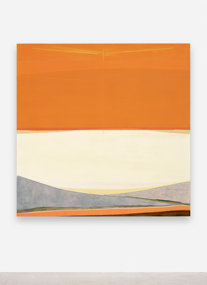
Untitled, 2020. Oil on canvas, 130×130 cm / 51 1/8×51 1/8 inches
Z.S.: In your compositions, you have developed some interesting ways of configuring space. Today, thanks to digital technology, we are able to represent space in ways that were previously impossible. Do you think there is a link between this new spatial paradigm of the digital age and the way you conceive of space in your paintings?
J.B.: The fact that I grew up in the 90s could have influenced my vision of the world, and of space. Television shows, the infinite loop of music videos, portable music players, video games — for years, this was what my universe was made up of. I think the common thread between all of these things is repetition. Televisions shows are recorded and rebroadcast, an mp3 player allows you to listen to a song over and over again, and with videogames, you can save as you go along so that a character never dies. We, therefore, have infinite access to various different spaces. As if we were at the center of a constellation of possibility. Today, this sensation of the infinite goes even further. When I was talking about ‘atmospheres’ before, I think this is a way of referring to this idea of infinite space. Like how with virtual reality, it above all an atmosphere that is created. Obviously, there is 3D representation and its vanishing lines. But this seems to me more like an invitation to project oneself mentally into a space that exceeds human proportions. As I see it, painting is less spectacular, and this isn’t a negative thing. But, in a certain way, color, too, can be perceived as an infinite space.
Z.S.: As you evoked earlier, your paintings depict mental landscapes, spaces in which we move through. Could you speak more about this?
J.B.: To continue what I was saying about color, I think that it’s the way that the different tonalities vibrate at the core of a painting that allows one access to visual memory. The way in which two colors resonate with each other can recall a place you’ve once visited, along with all the thoughts that go with that place. Last year, when I was traveling in the Californian desert, I remember a moment when I pulled over to look at a map. Getting out of the car, I saw that the landscape was completely flat, a uniform 180 degrees, as though from this position, the landscape could be expressed in 2D with one single line, continuous and infinite. Every place you visit is engraved differently in the mind, symbolized by a shape or a color or a scent. Certain colors allow me to remember places that left their mark, to remember certain thoughts, and then to intensify or magnify these thoughts, without painting their exact appearance. It’s also a way to touch the infinite space that we were talking about before with the tip of your finger, for one’s thoughts and memories cannot be limited to a finite number.
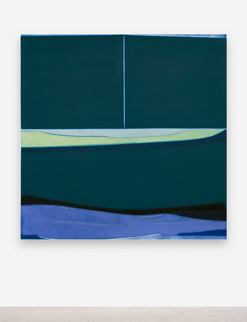
Untitled, 2020. Oil on canvas, 130×130 cm / 51 1/8×51 1/8 inches
Z.S.: In relation to this question of infinity, time occupies you just as much as space. The other day we talked about the contemporary phenomenon of ‘timeless time’, this idea that the connected world has put an end to the separation between personal and professional time. We are obliged to multi-task because everything happens simultaneously. I think that the virus makes this perpetual present even more apparent. Could you speak about your explorations into the nature of time, particularly this simultaneity?
J.B.: Well, yes, it seems increasingly apparent to me that personal and professional time are becoming more and more entangled. For me, Instagram is an example of this. It depends on how you use it, of course, but for me, the mood board aesthetic of the Instagram profile is a visual means to simultaneously show the diverse facets that make up our lives. Following many Instagram accounts is like watching multiple realities unfold at the same time. As I see it, the social network is a virtual world that occurs alongside our own. I find this aspect inspiring – even if sometimes its speed can be suffocating. I think that the internet functions in the same way, just on a bigger scale. The endless access to this simultaneous world, to both news as well as an incredibly large number of archives, thus interferes with my work in the studio, changing my perception of images. The retina receives so much information, some of which go straight to the unconscious, to then resurface as something else, in a drawing or a painting. This means that a painting is always loaded with various references, both conscious and unconscious. Each layer, each hue refers to the moment in which certain images were seen. Then each moment is superimposed onto the previous moment. This is why I have often talked to you about cyclical time or this idea of a perpetual present. When you look at a finished painting, all the colors appear on the same ground, since you are in front of a surface. Disparate shapes and colors, added at different moments, appear unified. Everything is seen together, at once. This is why I have the impression that painting is always in the present moment – and I find this redemptive.
Z.S.: I think that the fact that you have chosen to explore a contemporary phenomenon like ‘timeless time’ through the medium of abstract painting raises some important questions. For instance, abstract painting’s position within the art world, or in the world more broadly.
J.B.: The act of making paintings is, to me, a kind of loop-hole within the flow of time. Because a painting doesn’t have a duration – it isn’t bound by time like a piece of music, a video, or a performance – let alone a linear timeline. It’s like a gap in a roll of film. The present of the painting remains unchanged, a moment that never ends, while the perpetual present of everyday life that we were talking about before is, so it seems to me, a succession of moments immediately replaced one after the other. When you speak about ‘timeless time’ as a contemporary phenomenon, I understand this to mean a time fixed upon a continual novelty, a time which doesn’t accept mortality, nor the fact of aging. A present that endlessly renews itself.
Z.S.: This makes me think of the idea that today images are like the living dead, or zombies, who continually come back, or never really went away. They are like ghosts that haunt our screens long after they should have disappeared. In this digital age, we are witnessing the death of death itself. Nothing ever truly disappears, everything is stored forever.
J.B.: Yes. Today, we have nonstop access to the internet. Almost every person would have a presence on some kind of social network, or within the results of a search engine. Every day we live alongside images of people dead long ago, who then, through these images, become immortal. I have the impression that this online presence is changing my relationship with death and the idea of disappearance. For instance, we now have the urge to constantly refresh or reload our newsfeeds on various applications. This makes us obsessed with the content that is both new and anticipated, while what has just been posted 10 minutes ago already seems old and obsolete. I think that this obsession for the update is another example of this perpetual present we talked about earlier, like a television show with an endless number of episodes. Characters disappear regularly, but the show continues nevertheless. Immersed in this particular temporality, I find that maintaining a studio-based painting practice means that you experience time differently. Firstly, time at the studio has a different kind of flow, since there are no real tasks that have a definitive beginning or end. Then, what I particularly appreciate about working on forms that are more abstract, is that there is never any indication of time within the work. There is no narrative, nor anything that could place the composition within a linear temporality – a character’s age, an unfolding action, a detail in the background, for instance. I consider my paintings fluctuating between figuration and abstraction. It’s this fluctuating character that, for me, makes them atemporal.
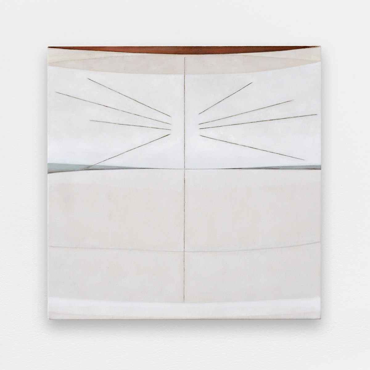
Untitled, 2020. Oil on canvas, 50×50 cm / 19 5/8×19 5/8 inches
Z.S.: Yes, and it’s in your exploration of this alternative space-time that we see how painting can be a means to discover a reality that is more fundamental than the one determined by social conventions, ideology, or linguistic structures. This returns us to the non-human and the idea that art can bring out pre-personal and affective forces that usually are not perceived by humans. In my opinion, it’s for this reason that art is different from politics: it’s about exploring alternative scenarios, a field of non-actualized potential, instead of critiquing an existing state of things or proposing solutions. What are your thoughts on this, especially today, in these turbulent times when contemporary art is becoming more and more political?
J.B.: I agree with you, I also think that art makes the exploration of alternative scenarios possible, particularly in how it makes these scenarios visible. Rather than proposing solutions, I think art is about opening up new ways of thinking and inviting reflection. I also have the intuition that art allows one to sense these ‘pre-personal and affective forces’, as you have put it. What I understand by this is the forces present before the formation of a human identity. I often have the impression that each work, for an artist, is the attempt to capture these forces, but this being impossible, the work ends up being only an extract, a glimpse of something unattainable. This is what makes a lot of works imperfect, human, and beautiful. Often, the intensity of an emotion, be this pleasant or painful, is reawakened by an insignificant detail or a banal object. Even if the intensity cannot be described, the object that provoked it still remains apparently insignificant. This is why I particularly like the work of artists that one could call hermetic or ambiguous. It is precisely the restraint, the bareness, that leaves room for many things since the gaze isn’t overloaded. Thought isn’t imposed, but rather many thoughts become possible. This is what evokes the question of politics within art. I think that an artist’s position can be articulated by many elements that are not immediately apparent in the work itself. For example, the materials used in the work, where these materials come from, the other collaborators called upon during the process, as well as the scale of the pieces themselves, and the particular contexts in which they are exhibited. I think that all of these factors count today. I’ve often talked to you about the final presence of the paintings, some of them being more compelling than others because of their materiality. I think that the question of politics equally exists at this level. One work might dominate a given space, where another might be more silent, repellent, or aggressive. Whatever presence it has, this is a position in itself. Today, in the context of the media, it is increasingly clear how the voices that are the most present, powerful, or strong, are not the most truthful. This questioning of power and those who influence it is inspiring. This is why I think that staying honest within one’s own practice is also a form of engagement, particularly when this doesn’t correspond to the criteria imposed by the dominant movement.
Z.S.: The idea that painting is an exploration of possible scenarios – the opening of the work onto an indeterminate future – is particularly evoked by your new series of more figurative paintings inspired by Tarot cards. Could you speak more about this series?
J.B.: This recent series is comprised of small figurative paintings inspired by imagery from the Tarot of Marseille. Sometimes referencing the aesthetic of the illustrations, but without modifying the composition, I have reinterpreted each card by concentrating on only a few elements. The idea was to move away from narration in order to give more importance to the materiality of the paint. The paintings remain figurative while still containing parts where the color takes precedence over the signification of the image. The series is painted in oils, on canvas primed with a mixture of glue and precipitated chalk, giving the surface of the canvas a smooth appearance, the opposite of my other paintings where the canvas is more porous. This very smooth and matte surface allows for more detail in the drawing, which was necessary in order to render the detail of the iconography. I selected certain cards for their symbols and their signification. Some symbols are very literal, like the animals who represent divine spirits. Despite this literal reading, I prefer to maintain a more abstract interpretation. I think of these paintings as pictograms, each one referring to a different idea or concept. For example, there is a card called ‘The Wheel of Fortune’. Among these multiple references, I hold onto the idea that any given order can be reversed at any moment. It is a general scenario that can be applied to any political, social, or emotional situation. I really like this idea of remembering an image in order to conceptualize a problem. When the cards are drawn in relation to a particular state of affairs or a current situation, each card indicates a different facet of the same problem. There is a ‘family of ideas’ attached to each card – like force, resilience, ruin, addiction… an image opens onto a whole network of meaning. To my mind, studying these families of words helps to deconstruct the status quo, to break it into pieces in order to better understand it. This makes me think of the simultaneity that we spoke of earlier, in the sense that each idea signified by each of the cards exists simultaneously with all the others. Thus there is always an alternative, and therefore the possibility to call a given order into question. There isn’t one version of the facts, but rather any particular order is only the result of various contingent factors at play at any given time. In this way, there is no right or wrong.
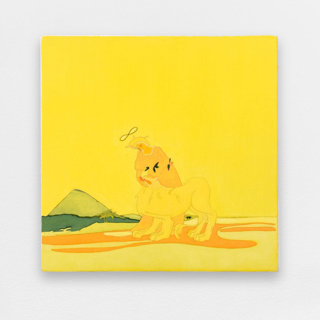
Force (Strenght), 2020. Oil and wax on canvas, 30×30 cm / 11 6/8×11 6/8 inches
Z.S.: In these paintings inspired by Tarots, we see animals and natural terrains. Even your most abstract paintings can be perceived as landscapes. This raises the question of the representation of nature in art, which is often considered a product of human culture. Western culture imposed a distinction between the natural non-human world and the cultural ‘human’ world. However, nature and culture are not divided in the same way within other cultures, and the frontier between the two doesn’t necessarily correspond with the opposition between the human and non-human. I think there is a link here with the ambiguous zone between figuration and abstraction that you observed in Brazil. Are you influenced by the non-anthropocentric thought of non-Western cultures?
J.B.: It seems to me that the way that nature and culture are entangled changes our perception of what is considered figurative or abstract. For example, motifs that seem abstract to us Westerners are for certain other non-Western cultures, the incarnation of divinities, or even spirits. Thus, when I am looking at non-Western art and craft practices, I notice that abstraction is often used to represent the presence of the non-human. This is not the way that I perceive my work, but there is perhaps an association that can be made in relation to this connection between the non-human and abstract painting. When I try and define what this non-human presence in painting could be, I come back to the materiality of the medium, and thus to color. Its materiality is what gives color its appearance, as well as its capacity to be spread over a surface. In painting, the type of canvas, the texture of the primer, the viscosity of the paint, and the mediums added to it – to give it more matte or satin finish – these are the tools to create a colored surface. By removing the figure, it seems to me that the authenticity of these materials is foregrounded, allowing you to appreciate them in all their manifest presence. Colour pigments are extracted from nature and come principally from plants and minerals. I find it inspiring to know the histories of these rocks and plants. It influences my practice in how I choose my colors. For example, I prefer to use mainly colors that have not already been mixed – like primary yellow or lapis lazuli – to then transform them by adding other pure pigments such as titanium white or sienna. Being conscious of this permanent relationship with nature is a way of anchoring my work in the tangibility of the world. Also, my role becomes diminished, in the sense that I use substances that are already present in the universe, that precede human existence. I think that this position approaches a non-anthropocentric way of thinking according to which, as humans, our existence is dependent upon the conservation of our environment and an acknowledgment that this environment is a living entity that we must live within, without dominating it, nor destroying it. All while recognizing that its scale superior to us. In this sense, I feel that since we are in a universe that surpasses us, art is often a means to render this immensity more human, in order to better assimilate it – to put at our scale. It’s for that reason that I mentioned to you this idea of an artist’s work being a visual extract of something otherwise impalpable. Certain artists that I have worked with have created a whole practice around this process of miniaturization, in order to reduce the unbearable magnitude of something to a human scale – the overpowering intensity of pain, the relentlessness of information, an overbearing emotion, or the breadth of the world in general. Without exactly articulating my work within a non-anthropocentric framework, I think there can be certain links like the fact of recognizing and accepting the limits of being human and working with the perceptions that are implied by this. I am more and more inclined to consider my practice in such a way. From the choice of materials, the size of my paintings, and of course, the choice to make paintings in the first place.
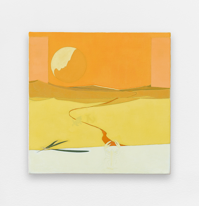
Lune (Moon), 2020. Oil and wax on canvas, 30×30 cm / 11 6/8×11 6/8 inches
Zoe Stillpass is an American art historian based in Paris. In 2018, she obtained her Ph.D. in the history and theory of art from the École des Hautes Études en Sciences Sociales in Paris (EHESS). Her research focuses on artistic practices that, since the late twentieth century, have called attention to non-human agency. She regularly contributes to international contemporary art magazines and exhibition catalogs. She also teaches a seminar entitled “History of Contemporary Ideas” in the MFA program at the École Cantonale d’Art de Lausanne (ÉCAL).